I was having an issue displaying a No Results placeholder – the code-behind was PHP, and it was using a while statement to display the results, when there were no results the code was adding whitespace so showing a placeholder using :empty was not an option. The obvious thing to do was to change the while to an if/else but I have no real understanding of PHP so that was not really an option.
After a lot of searching for solutions, including PHP, JavaScript and removing unnecessary whitespace in the PHP I ended up going back to basics and using adjacent sibling selectors – which turned out to be a very simple solution. It’s probably not ideal but it worked perfectly for me, and it could do for you as well.
You simply add your No Result placeholder as the last element in the results array and you add a rule to to hide it when your CSS rule matches the . So,
I added the .sr-only text for accessibility reasons, because I am using an image for the placeholder, so you can ignore it if you are displaying a text message. The CSS for .sr-only is:
The only drawback I can think of, in terms of usability and accessibility is that some screen readers may pick up the .noval content if it’s visually hidden – if that’s a major concern it should be a fairly simple matter to hide or display that using JavaScript to add the HTML5 attribute hidden or the Aria attribute aria-hidden="true" to the <li class="noval">
I’ve been looking for, and unable to find, a menu that goes from a vertical menu to hamburger menu.
So this is my attempt at making one. As an added bonus it’s pure CSS, and requires no JS.
I’m not going to explain how it works in detail, but basically the functionality is triggered by changing the state of the (hidden) checkbox, by clicking the label (which is styled as the hamburger), this allows me to use the adjacent sibling combinator Read On >>Pure CSS responsive menu, vertical to hamburger
This is a quickie, and not really related to UX. But if you ever find yourself wondering what that auto-filled password you saved a few years ago is, do the following.
Press f-12 on the browser you’re using. This will open the developer tools panel on most browsers. If your chosen browser doesn’t have developer tools installed you can probably download them from the browser’s add-on/plugin/etc. store.
On the login form, select the password field (element), which has the masked password.
In the developer tools panel you will see the HTML code for that element highlighted.
Double-click where it says “password” and change it to “text”
I created these for a project, where accessibility was mandatory and the primary user was of an older age profile. When considered in context of the target user, standard HTML checkboxes and labels were not ideally suited, the small target area of the label and the checkbox being the main issue. Read On >>Pure CSS, accessible custom checkbox/tickbox and label
The Citizens’ Portal is a responsive, accessible public portal, designed to allow the public create, edit, submit and check on progress of self-assessments. It’s built to AA accessibility standards, and is fully responsive.
I was responsible for all UI artwork and design, accessibility design, responsive design and front-end (HTML and CSS).
Eye tracking is the process of measuring either the point of gaze or the motion of an eye relative to the head. (Wikipedia contributors, 2018).
Eye tracking enables researchers detect how long the test subject looks at something, the path their eyes follow, and what point in time they look at it.
In UX design, eye tracking enables designers understand how users view a website, and gives an understanding of how they interpret the visual hierarchy of that site. Read On >>Eye Tracking Report – Parkrun.ie
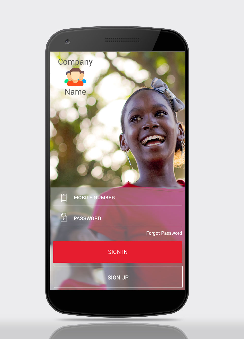
This post maps the redesign of two user journeys for an existing app. The journeys that have been redesigned are the Logging In, and Sending Cash processes.
User research has not been included, and the app has been anonymised.
App Login Screen
A more visual login screen, with inspiring imagery which is aligned with brand personality.
The Sign In, and Sign Up buttons have been made equal size, with extra visual weight being applied to the Sign In button
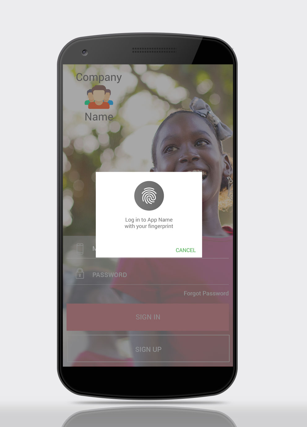
Login Screen – Fingerprint Login Option
Include biometrics-based security, including fingerprint authentication.
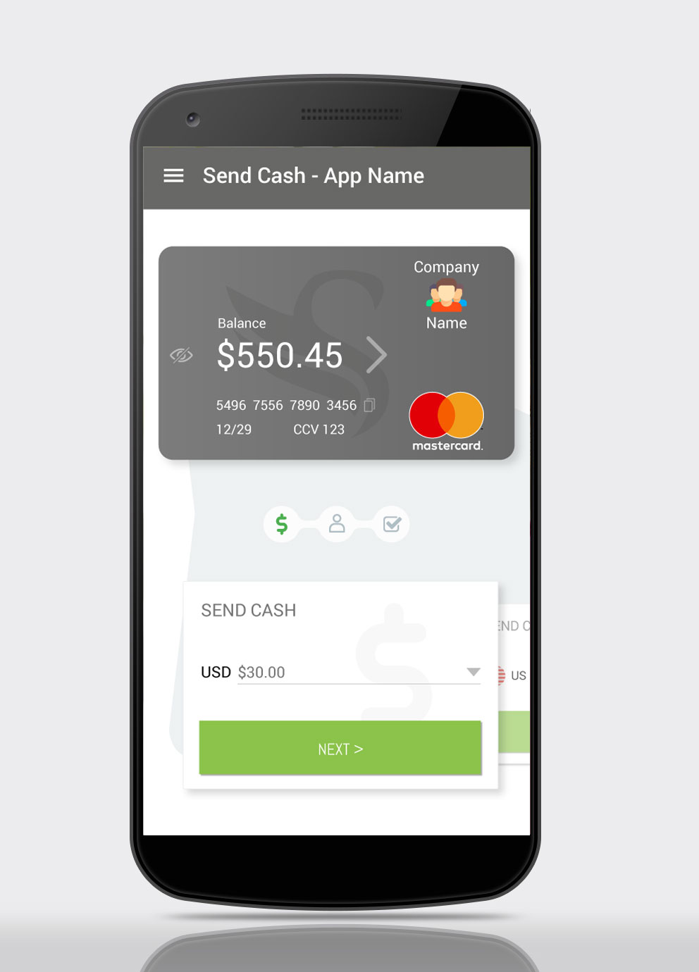
Send Cash, Step 1
This is the app homescreen, the user lands here after logging in. It is also the first step of cash transfer process, as this has been identified as the action users carry out most frequently.
This step allows the user input the amount of cash they will be sending. Previous transaction amounts will be available via the dropdown, along with preset amounts e.g. $5, $10, $20, $50, $100. The user will also be able enter the amount manually in the text field.
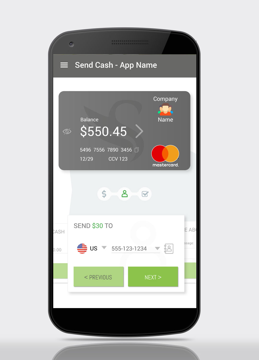
Send Cash – Step 2
In Step 2 the user enters the recipient details. The recipient’s number can be added manually, and recent recipients are available via the dropdown.
The user can also access their contacts via the Contacts icon.
Applying the Gestalt Principle of Continuation to imply process stages, the Send Cash process is styled in a marquee-type manner. The previous and next step in the process appear behind the current step, clipped.
The previous step is clickable, should the user wish to amend the transaction details .
A clickable progress indicator is used to highlight the user’s current position in the process, and again the previous step is clickable, should the user wish to amend the transaction details.
The amount entered in the previous card is highlighted in the current card – in this case “Send $30 to”, to reassure users they entered the correct amount in the previous step.
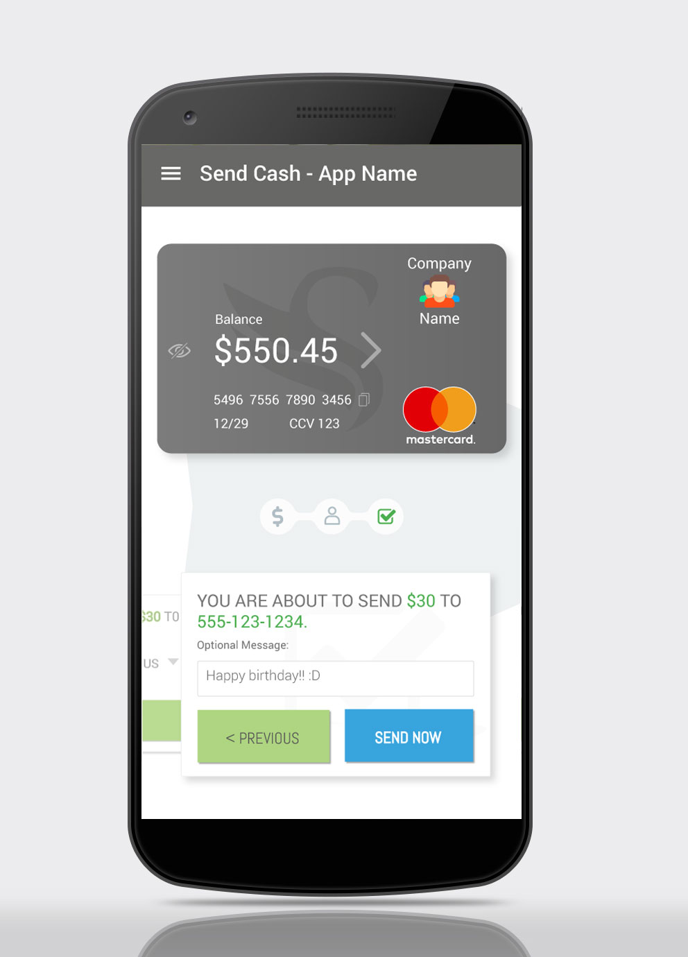
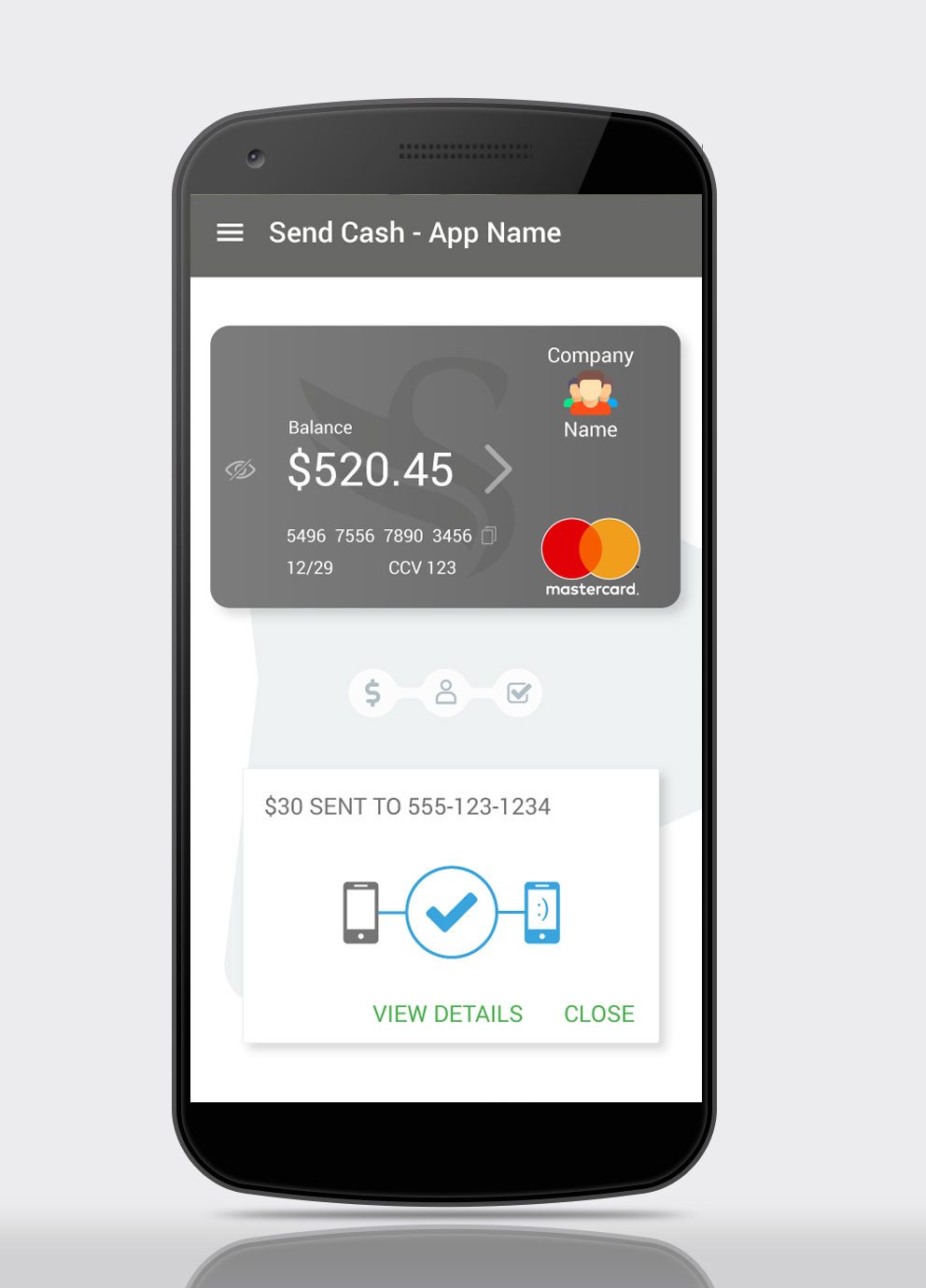
Send Cash – Step 3
In the final step, Step 3, the user has the option to add a message to the transaction.
Also, as in the previous screen, details entered in earlier screens are highlighted in the current card – in this case “You are about to send $30 to 555-123-1234”, to reassure users they have entered the correct data.
Should they wish to do so, the user can tap the previous step’s card to access it, and they can also access the steps via the progress indicator. They can also access previous steps via the highlighted, linked text, in the transaction summary.
The Send Now button has been styled with a blue background to differentiate it from the previous card buttons, as they only took the user to the next step in the process, whereas this button completes the process, and sends the cash.
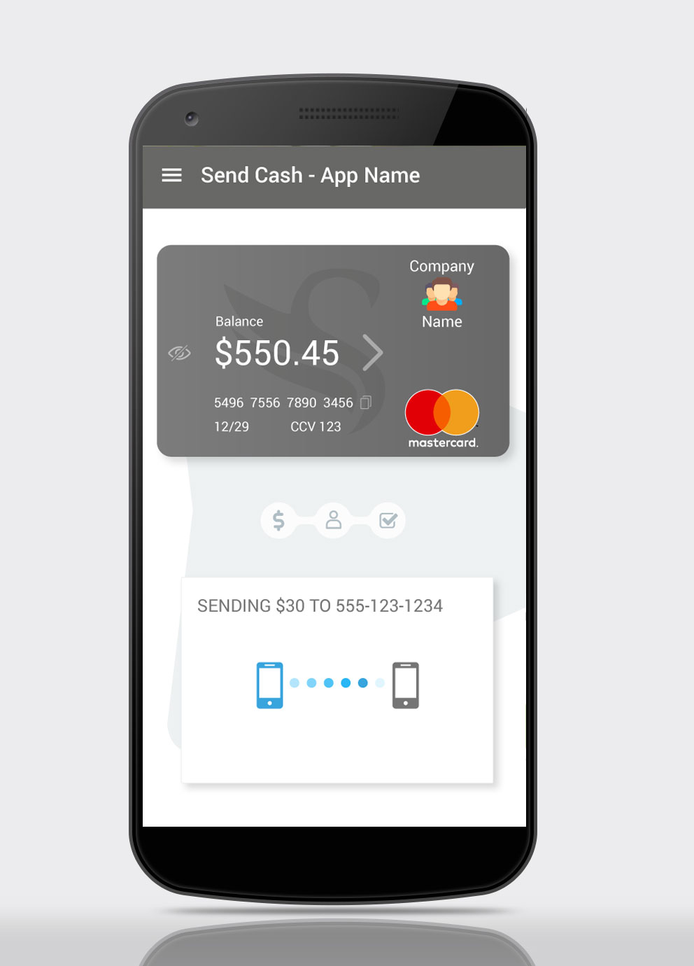
Sending Cash
While the transfer is in progress an animation is shown, to reassure the user the transaction is being processed.
If the transfer is instantaneous, it is recommended to show the animation for three to five seconds, regardless. This is done to reassure users, during a UX stress point that their device, and app, are all hard at work for them. This process is known as Artificial Waiting.
Cash Sent
In this screen, we see the animation from the previous screen has been replaced by a check mark to indicate the process has been completed. The recipient device has been highlighted in blue.
Leveraging the Peak-End Rule (psychological heuristic) an animated smiley has been added, this micro-interaction gives the app personality, and gives the user a moment of relief at the end of a potentially stressful process.
The user has the option to either view the transaction details, or close the transaction and return to the app homescreen (Send Cash – Step 1).
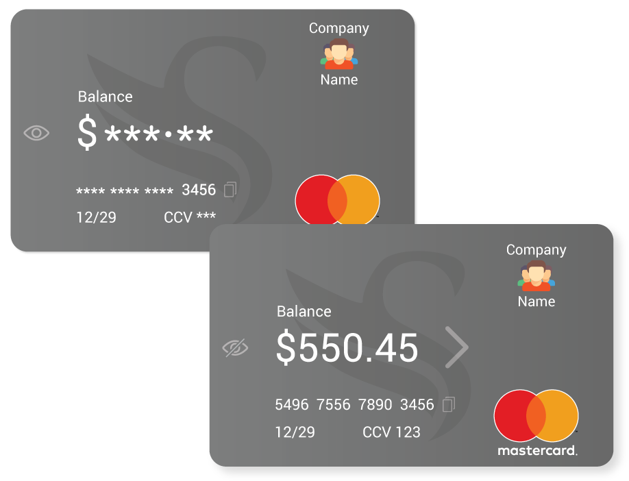
Security Features
The empathy map indicates the main concern of the primary user is security – opening the app in public and revealing sensitive information, being one concern.
For this reason, in its default state the balance, card number, and CCV are masked by default. Tapping the eye icon reveals those hidden details. Tapping the eye icon again returns it to its masked state. The default state, masked or unmasked, can be set in the app settings.
Beside the credit card number is a Copy icon, selecting this copies the credit card number to the device memory, allowing users to paste the number when making online purchases. Copying is confirmed by a toast notification.
The > to the right of the balance takes the user to their recent transactions, this is an established design pattern, employed by PayPal and others, and so will be familiar to primary users.
The rise of the internet and mobile devices has altered the process of software development. With the rapid evolution and deployment of applications across the internet, software developers now need to react quickly to changes in technology, customer requirements and feedback, and rapidly-evolving competition in their sector. These changes in requirements and competition have lead to organisations gaining a competitive advantage by adopting user centered design (UCD) processes, and agile developmentRead On >>UX Design and Agile Development
Gestalt Psychology originated from a movement which became popular in Berlin in the 1920s. Gestalt seeks to make sense of how our minds perceive things in whole forms, rather than their individual elements (Busche L.). The most prominent founders of Gestalt theory were Max Wertheimer, Wolfgang Kohler, and Kurt Koffka.
The theory of Gestalt, is that, in order to simplify the many different signals encountered in day-to-day life, the brain attempts to reduce its cognitive burden by categorising these signals into groups, wherever possible.
Gestalt is a set of principles, or laws. Kurt Koffka summarised the principles as: “The whole is other than the sum of parts.” (“Gestalt psychology,” n.d.) Meaning the perception of an entity as a whole, is different to that of the individual parts it is composed of.
The word Gestalt is used in modern German to describe how something has been “placed,” or “put together.” (Encyclopædia Britannica 1998). Gestalt can also be referred to as the “Law of Pragnanz” or the “Law of Simplicity.”
The Gestalt principles, when applied to user interface design, are valuable as they tap into fundamentals of cognition, that are true across all people (Dain M. 2014), and when applied correctly, Gestalt principles help the interface designer guide the users towards their goals.
The Gestalt Principles include:
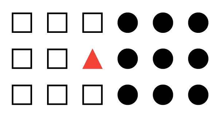
Principle of Similarity
The Principle of Similarity states that visually similar components within an object will be perceived as groups. These similarities can originate from qualities including the components’ shapes, size, colour and shading.
When similarity amongst components occurs and grouping is perceived, an element can be highlighted if it is dissimilar to the others. When this occurs it is known as an anomaly.
Figure 2. Principle of Similarity: Amongst these components there are two perceived groups, the outlined squares, and the solid circles. The red triangle is an anomaly.
In user interface design the Principle of Similarity can be leveraged to increase the learnability of a product, to guide users’ expectations, or, where an anomaly occurs, it can help focus the user on an important element, such as a Call to Action (CTA) button.
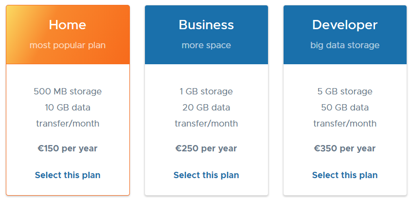
Figure 3. Principle of Similarity: hosting plans, using a similarity anomaly to highlight their recommended hosting plan, to prospective customers – from www.iseek.ie
Principle of Continuation
The Principle of Continuation applies to humans’ inclination to interpret and project direction and movement.
People choose to visually interpret and continue the direction of movement of an element, as being the one with the least visual friction. Whether this direction of movement is implied, or whether it is initiated by the sweep of the element.
Another application of this principle is that when faced with multiple elements, humans are more likely to group the elements with similar directional changes together.
Figure 3. The sweeping arrow in the Amazon logo uses the Principle of Continuation to reinforce the A to Z of its servicesFigure 4. The Principle of Continuation establishes a direction and leads site visitors horizontally through each row. Apple.com
Principle of Closure
When looking at a complex arrangement of individual elements, humans tend to first look for a single, recognisable pattern. (Rutledge A, 2009)
The Principle of Closure occurs when elements hint at a shape rather than actually completing it – it is still perceptible. Human minds complete the shape, even though it doesn’t fully exist. People mentally combine positive and negative space to complete the image.
Figure 5. The WWF mark – even though the image is incomplete, the human mind completes the shape so it sees a panda.
In interface design, this innate desire to complete objects and shapes is leveraged on mobile devices, where space is limited. Horizontal lists are intentionally clipped to encourage users to scroll horizontally to view more content.
Figure 6. Principle of closure in the Google Play store, category listings and cards are intentionally clipped to encourage horizontal scroll to further content.
Principle of Proximity
The Principle of Proximity considers that, groupings of objects, aligned in what could be perceived as a pattern, are perceived as being part of a unit. And, as part of a unit their relationship and meaning could be considered comparable.
Conversely, if items are spread far enough apart, without pattern or any other obvious relationship, they are perceived as separate items, for the user, parsing and understanding these elements is more difficult as each element needs to be considered individually.
Figure 7. Principle of Proximity. The circles on the left are perceived as individual entities, however those on the right are perceived as a group
The principle of proximity, in user interface design is applied where the designer wishes to demonstrate a relationship, between elements of similar meaning, relationship or value, in relation to the user goal.
Misuse of this principle, whether intentional or not, can occur when objects with no real relationship are grouped by proximity or alignment, mistakenly creating a relationship between the objects.
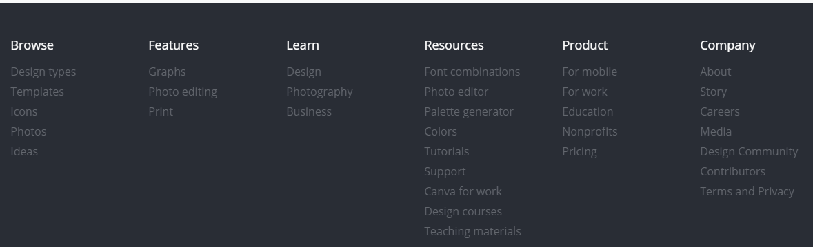
Figure 8. The footer of canva.com uses the principle of proximity to visually group menu items
Principle of Figure and Ground
Figure and Ground has come about as a direct translation of people’s three-dimensional view of the real world. With Figure and Ground that view is transferred to two dimensional space, and the expectation of depth – where people consider elements as being either figure, the foreground object, or ground, the background.
Figure 10. Principle of figure ground, by Zentatsu, 2017. https://zentatsu.deviantart.com/art/Figure-Ground-reverse-317631175, Used under Creative Commons Attribution 2.0 Generic License: http://creativecommons.org/licenses/by/2.0/deed.en
Figure and ground has been used in modern instances, to lessen the impact of device orientation on mobile devices and other emerging form factors. Switching between landscape and portrait mode has become less of a cognitive burden on the user, and easier to facilitate for the designer by implementing the popular card metaphor in their designs. The card itself becomes figure, and the remaining space becomes ground.
Figure 11. Principle of Figure Ground – the effect of unpredictable device orientation is minimised by using figure and ground to focus the users attention on the figure (front) elements.
Principle of Symmetry
People innately enjoy recognition and pattern, and reject dissonance and asymmetry. (Dain M. 2014)
The principle of symmetry states that the mind perceives objects as being symmetrical and forming around a centre point. It is perceptually pleasing to divide objects into an even number of symmetrical parts. (“Gestalt psychology,” n.d.) Therefore, when our minds encounter a group of symmetrical elements it will perceive them as a coherent shape, or unified group.
For example, the image below shows four curled and two square brackets. However when the image is viewed, we tend to perceive three pairs of symmetrical brackets rather than six individual brackets.
Figure 12. In the above image, we perceive these brackets as three pairs, instead of six individual brackets.Figure 13. Gestalt Principle of symmetry – avioc.com
Site Review – ManUtd.com
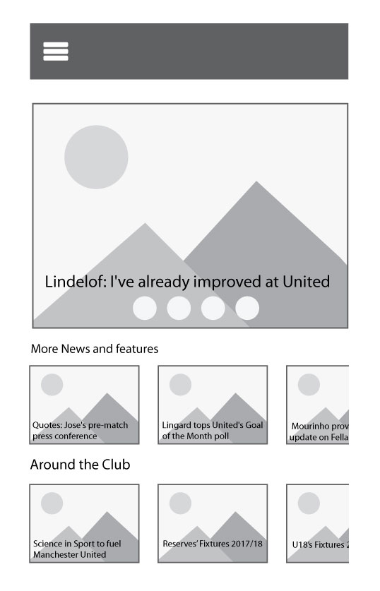
Figure 14. Current Manchester United landing page
The site chosen for review was http://www.manutd.com , website of English Premership football team, Manchester United.
The Manutd.com landing page appears to be primarily focused on news, the current style appears old and cluttered, with little thought given to user experience, and user interface. The site is responsive, however the mobile version seems to be little more that a basic translation of the user interface, from desktop to mobile, with little thought given to the challenges and opportunities provided by each form factor.
The Gestalt Principles being applied to it are the Principles of Similarity, Figure and Ground, Continuation, Closure and Proximity.
Figure 15. Low-fidelity wireframe of Manutd.com landing page, with Gestalt Principles applied.
Principle of Similarity
The dissimilarity, in terms of size, of the main feature story, at the top of the page make it an anomaly. An anomaly such as this is used to attract the users’ attention, and to highlight the element.
Principle of Figure and Ground
Each news article has been presented in card format, focusing the user’s attention on the figure (foreground element), using figure and ground in this way lessens the design challenges presented by changes in device orientation, as the user focuses on the individual elements, the cards, which remain unchanged, regardless of orientation.
Principles of Continuation and Closure
The horizontal layout of the news stories leads users through articles, and the intentional clipping of the third article in each category acting as a signifier of horizontal scrolling to the user.
Principle of Proximity
Articles from each of the different news category have been moved closer together, this grouping of objects reinforces the relationship between articles and the category under which they appear.
References
Dain M. (2014, October 16). Gestalt theory for interface designers – 3 similarity. Retrieved 26 March 2018, from http://michaeldain.com/2014/10/gestalt-theory- for-interface-designers-3-similarity/
Encyclopaedia Britannica (n.d.). “Gestalt Psychology.”, Retrieved 28 March 2018, from www.britannica.com/science/Gestalt-psychology.
Busche, L. (n.d.). Simplicity, Symmetry and More: Gestalt Theory And The Design Principles It Gave Birth To. Retrieved 26 March 2018, from https://www.canva.com/learn/gestalt-theory/
Gestalt psychology. (n.d.). Retrieved 26 March 2018, fromhttps://en.wikipedia.org/wiki/Gestalt_psychology
Rutledge, A. (2015, August 25). Gestalt Principles of Perception – 5. Closure. Retrieved 1 March 2018, from http://www.andyrutledge.com/closure.html


