This post maps the redesign of two user journeys for an existing app. The journeys that have been redesigned are the Logging In, and Sending Cash processes.
User research has not been included, and the app has been anonymised.
App Login Screen
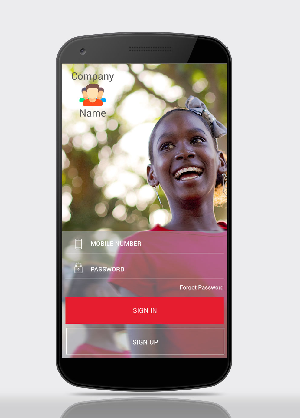
A more visual login screen, with inspiring imagery which is aligned with brand personality.
The Sign In, and Sign Up buttons have been made equal size, with extra visual weight being applied to the Sign In button
Login Screen – Fingerprint Login Option
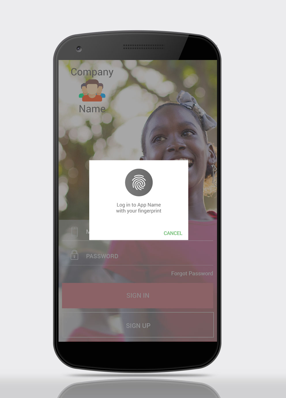
Include biometrics-based security, including fingerprint authentication.
Send Cash, Step 1
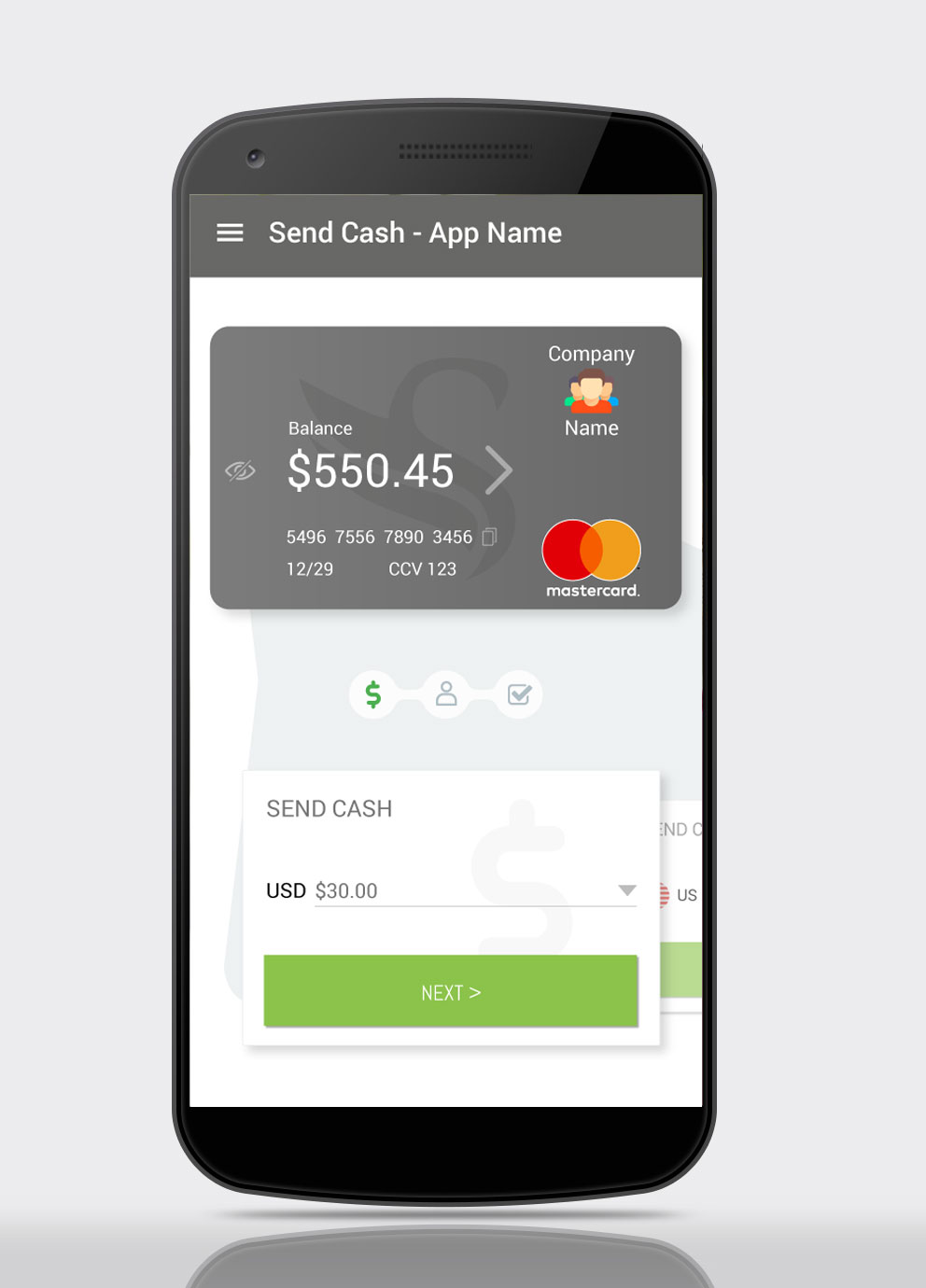
This is the app homescreen, the user lands here after logging in. It is also the first step of cash transfer process, as this has been identified as the action users carry out most frequently.
This step allows the user input the amount of cash they will be sending. Previous transaction amounts will be available via the dropdown, along with preset amounts e.g. $5, $10, $20, $50, $100. The user will also be able enter the amount manually in the text field.
Send Cash – Step 2
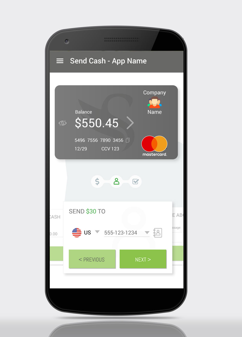
In Step 2 the user enters the recipient details. The recipient’s number can be added manually, and recent recipients are available via the dropdown.
The user can also access their contacts via the Contacts icon.
Applying the Gestalt Principle of Continuation to imply process stages, the Send Cash process is styled in a marquee-type manner. The previous and next step in the process appear behind the current step, clipped.
The previous step is clickable, should the user wish to amend the transaction details .
A clickable progress indicator is used to highlight the user’s current position in the process, and again the previous step is clickable, should the user wish to amend the transaction details.
The amount entered in the previous card is highlighted in the current card – in this case “Send $30 to”, to reassure users they entered the correct amount in the previous step.
Send Cash – Step 3
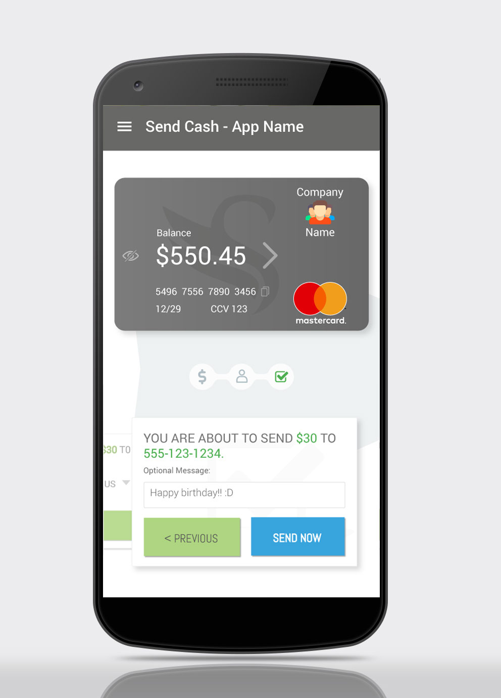
In the final step, Step 3, the user has the option to add a message to the transaction.
Also, as in the previous screen, details entered in earlier screens are highlighted in the current card – in this case “You are about to send $30 to 555-123-1234”, to reassure users they have entered the correct data.
Should they wish to do so, the user can tap the previous step’s card to access it, and they can also access the steps via the progress indicator. They can also access previous steps via the highlighted, linked text, in the transaction summary.
The Send Now button has been styled with a blue background to differentiate it from the previous card buttons, as they only took the user to the next step in the process, whereas this button completes the process, and sends the cash.
Sending Cash
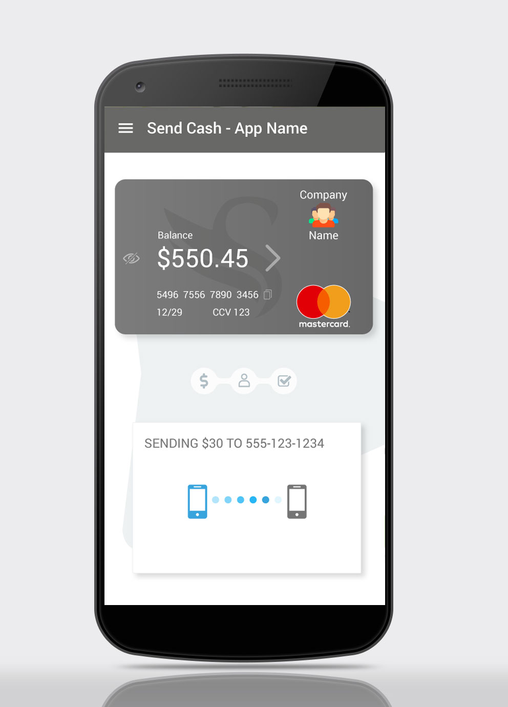
While the transfer is in progress an animation is shown, to reassure the user the transaction is being processed.
If the transfer is instantaneous, it is recommended to show the animation for three to five seconds, regardless. This is done to reassure users, during a UX stress point that their device, and app, are all hard at work for them. This process is known as Artificial Waiting.
Cash Sent
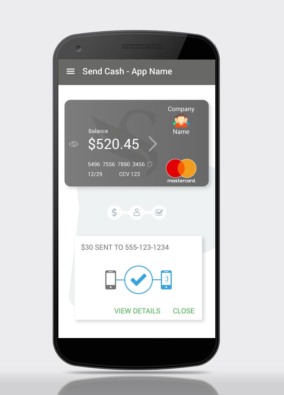
In this screen, we see the animation from the previous screen has been replaced by a check mark to indicate the process has been completed. The recipient device has been highlighted in blue.
Leveraging the Peak-End Rule (psychological heuristic) an animated smiley has been added, this micro-interaction gives the app personality, and gives the user a moment of relief at the end of a potentially stressful process.
The user has the option to either view the transaction details, or close the transaction and return to the app homescreen (Send Cash – Step 1).
Security Features
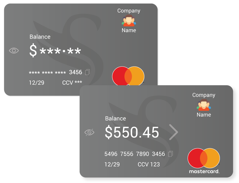
The empathy map indicates the main concern of the primary user is security – opening the app in public and revealing sensitive information, being one concern.
For this reason, in its default state the balance, card number, and CCV are masked by default. Tapping the eye icon reveals those hidden details. Tapping the eye icon again returns it to its masked state. The default state, masked or unmasked, can be set in the app settings.
Beside the credit card number is a Copy icon, selecting this copies the credit card number to the device memory, allowing users to paste the number when making online purchases. Copying is confirmed by a toast notification.
The > to the right of the balance takes the user to their recent transactions, this is an established design pattern, employed by PayPal and others, and so will be familiar to primary users.