About Gestalt Psychology
Gestalt Psychology originated from a movement which became popular in Berlin in the 1920s. Gestalt seeks to make sense of how our minds perceive things in whole forms, rather than their individual elements (Busche L.). The most prominent founders of Gestalt theory were Max Wertheimer, Wolfgang Kohler, and Kurt Koffka.
The theory of Gestalt, is that, in order to simplify the many different signals encountered in day-to-day life, the brain attempts to reduce its cognitive burden by categorising these signals into groups, wherever possible.
Gestalt is a set of principles, or laws. Kurt Koffka summarised the principles as: “The whole is other than the sum of parts.” (“Gestalt psychology,” n.d.) Meaning the perception of an entity as a whole, is different to that of the individual parts it is composed of.
The word Gestalt is used in modern German to describe how something has been “placed,” or “put together.” (Encyclopædia Britannica 1998). Gestalt can also be referred to as the “Law of Pragnanz” or the “Law of Simplicity.”
The Gestalt principles, when applied to user interface design, are valuable as they tap into fundamentals of cognition, that are true across all people (Dain M. 2014), and when applied correctly, Gestalt principles help the interface designer guide the users towards their goals.
The Gestalt Principles include:
Principle of Similarity
The Principle of Similarity states that visually similar components within an object will be perceived as groups. These similarities can originate from qualities including the components’ shapes, size, colour and shading.
When similarity amongst components occurs and grouping is perceived, an element can be highlighted if it is dissimilar to the others. When this occurs it is known as an anomaly.
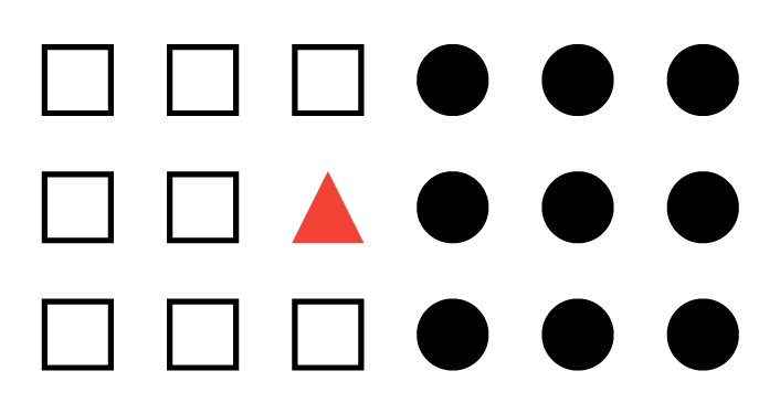
In user interface design the Principle of Similarity can be leveraged to increase the learnability of a product, to guide users’ expectations, or, where an anomaly occurs, it can help focus the user on an important element, such as a Call to Action (CTA) button.

Principle of Continuation
The Principle of Continuation applies to humans’ inclination to interpret and project direction and movement.
People choose to visually interpret and continue the direction of movement of an element, as being the one with the least visual friction. Whether this direction of movement is implied, or whether it is initiated by the sweep of the element.
Another application of this principle is that when faced with multiple elements, humans are more likely to group the elements with similar directional changes together.
Principle of Closure
When looking at a complex arrangement of individual elements, humans tend to first look for a single, recognisable pattern. (Rutledge A, 2009)
The Principle of Closure occurs when elements hint at a shape rather than actually completing it – it is still perceptible. Human minds complete the shape, even though it doesn’t fully exist. People mentally combine positive and negative space to complete the image.

In interface design, this innate desire to complete objects and shapes is leveraged on mobile devices, where space is limited. Horizontal lists are intentionally clipped to encourage users to scroll horizontally to view more content.

Principle of Proximity
The Principle of Proximity considers that, groupings of objects, aligned in what could be perceived as a pattern, are perceived as being part of a unit. And, as part of a unit their relationship and meaning could be considered comparable.
Conversely, if items are spread far enough apart, without pattern or any other obvious relationship, they are perceived as separate items, for the user, parsing and understanding these elements is more difficult as each element needs to be considered individually.

The principle of proximity, in user interface design is applied where the designer wishes to demonstrate a relationship, between elements of similar meaning, relationship or value, in relation to the user goal.
Misuse of this principle, whether intentional or not, can occur when objects with no real relationship are grouped by proximity or alignment, mistakenly creating a relationship between the objects.
Principle of Figure and Ground
Figure and Ground has come about as a direct translation of people’s three-dimensional view of the real world. With Figure and Ground that view is transferred to two dimensional space, and the expectation of depth – where people consider elements as being either figure, the foreground object, or ground, the background.
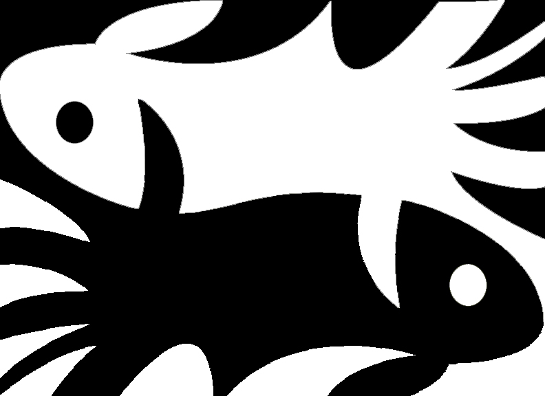
Figure and ground has been used in modern instances, to lessen the impact of device orientation on mobile devices and other emerging form factors. Switching between landscape and portrait mode has become less of a cognitive burden on the user, and easier to facilitate for the designer by implementing the popular card metaphor in their designs. The card itself becomes figure, and the remaining space becomes ground.
Principle of Symmetry
People innately enjoy recognition and pattern, and reject dissonance and asymmetry. (Dain M. 2014)
The principle of symmetry states that the mind perceives objects as being symmetrical and forming around a centre point. It is perceptually pleasing to divide objects into an even number of symmetrical parts. (“Gestalt psychology,” n.d.) Therefore, when our minds encounter a group of symmetrical elements it will perceive them as a coherent shape, or unified group.
For example, the image below shows four curled and two square brackets. However when the image is viewed, we tend to perceive three pairs of symmetrical brackets rather than six individual brackets.

Site Review – ManUtd.com

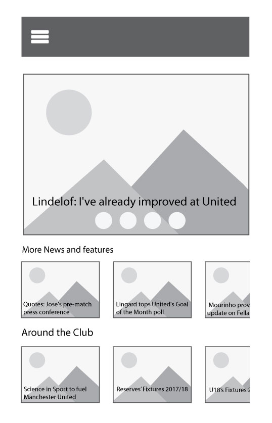
The site chosen for review was http://www.manutd.com , website of English Premership football team, Manchester United.
The Manutd.com landing page appears to be primarily focused on news, the current style appears old and cluttered, with little thought given to user experience, and user interface. The site is responsive, however the mobile version seems to be little more that a basic translation of the user interface, from desktop to mobile, with little thought given to the challenges and opportunities provided by each form factor.
The Gestalt Principles being applied to it are the Principles of Similarity, Figure and Ground, Continuation, Closure and Proximity.
Principle of Similarity
The dissimilarity, in terms of size, of the main feature story, at the top of the page make it an anomaly. An anomaly such as this is used to attract the users’ attention, and to highlight the element.
Principle of Figure and Ground
Each news article has been presented in card format, focusing the user’s attention on the figure (foreground element), using figure and ground in this way lessens the design challenges presented by changes in device orientation, as the user focuses on the individual elements, the cards, which remain unchanged, regardless of orientation.
Principles of Continuation and Closure
The horizontal layout of the news stories leads users through articles, and the intentional clipping of the third article in each category acting as a signifier of horizontal scrolling to the user.
Principle of Proximity
Articles from each of the different news category have been moved closer together, this grouping of objects reinforces the relationship between articles and the category under which they appear.