Project Context, Background and Aim
The project requires you, working individually, to analyse and test the information architecture and content of an existing site.While you will not have knowledge of the entire content strategy at work, the effectiveness of this strategy will be reflected in the quality of the content on the site (text content, language used on labels, tone of voice, consistency writing style, etc.).
1. Overview
KBC Bank is an Irish bank with over 1000 employees in Dublin, Cork, Limerick, Galway, Kilkenny, Waterford and Kildare.
Formed over 40 years ago, KBC Bank “are dedicated to creating a bank where you come first.”
KBC’s website can be found at https://www.kbc.ie. This analysis examines the information architecture and content – including text content, language used on labels, tone of voice, and consistency of writing style.
2. Information Architecture Components
2.1 Navigation System
The main KBC navigation system structure is narrow and deep – there are four main headings – Our Products, Why KBC, Contact Us, and Help.
When the site visitor clicks any of these tier 1 links, a megamenu panel opens. This megamenu format offers a broad and shallow hierarchy.
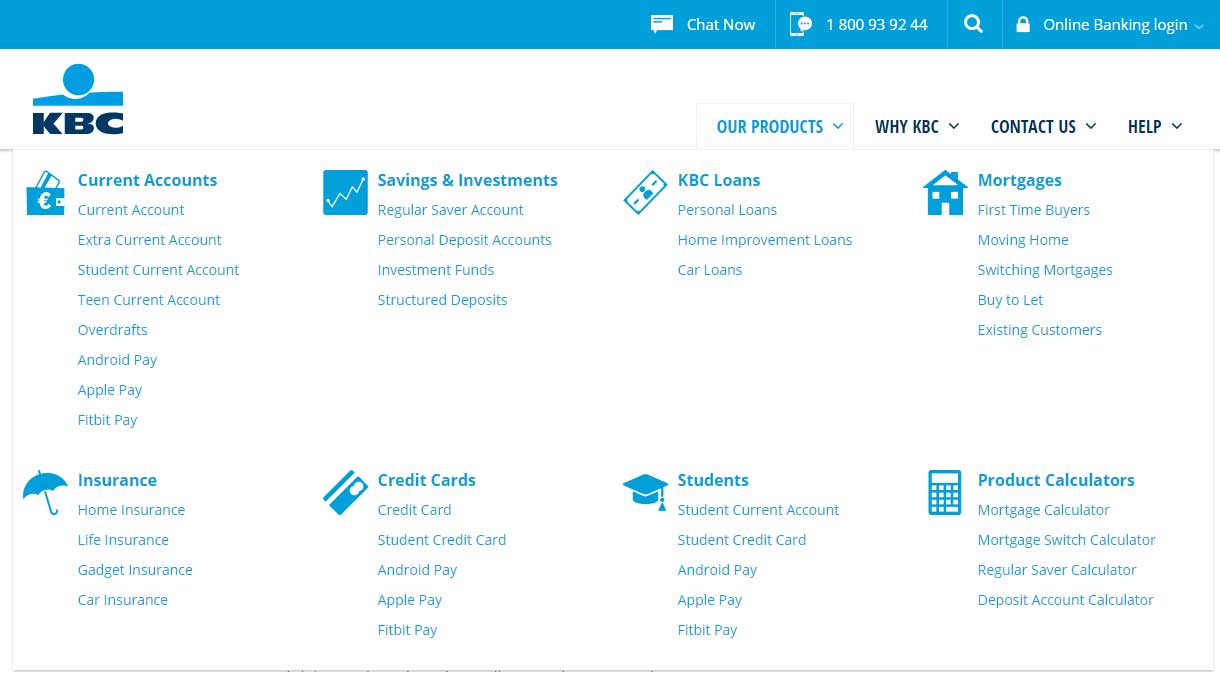
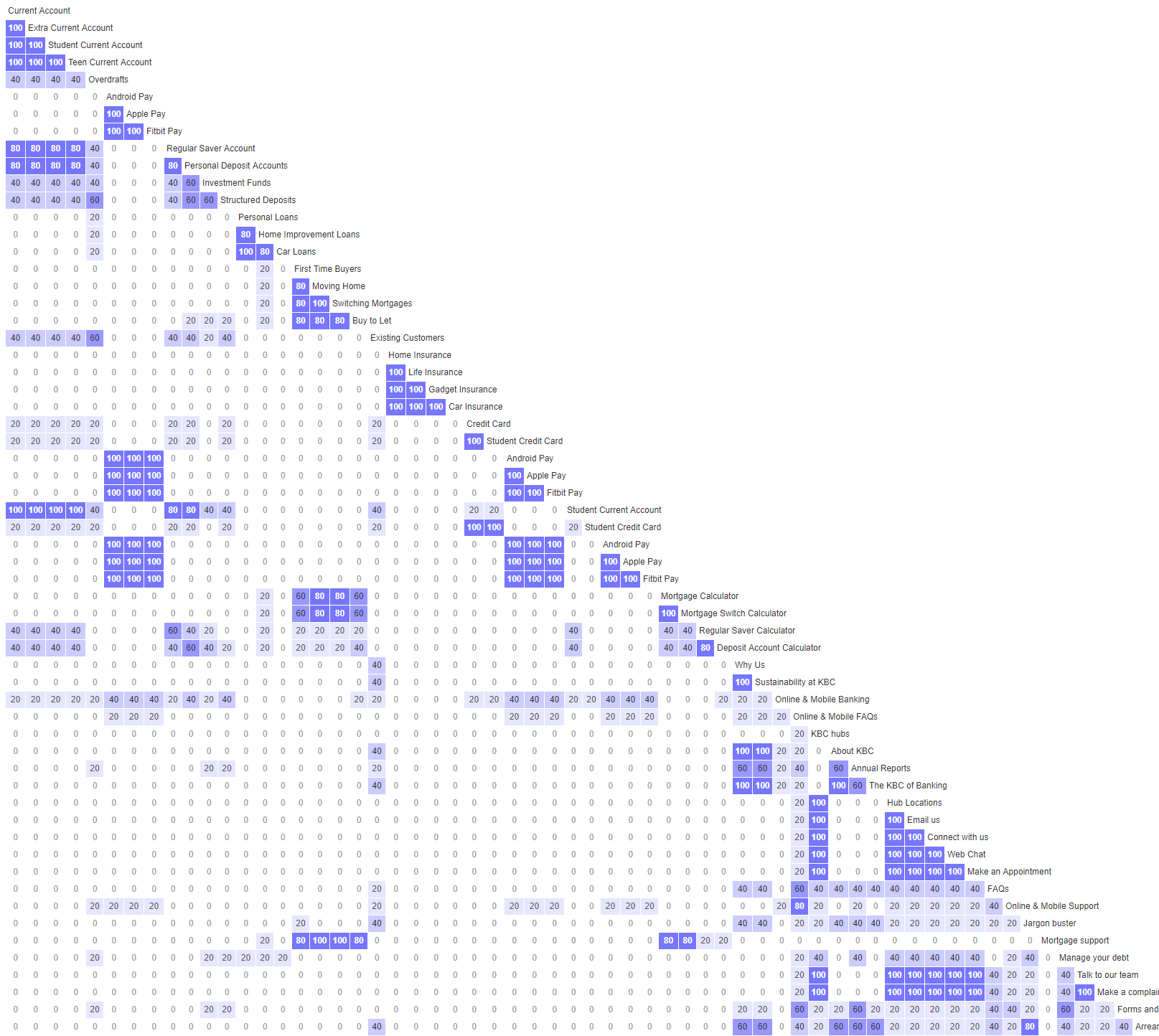
The Our Products menu panel has 46 links, split across 8 different groups, each group heading is associated with an icon. This large amount of links could appear overwhelming, however chunking, and use of section headings and category icons make the information easier to digest, and aid scanning.
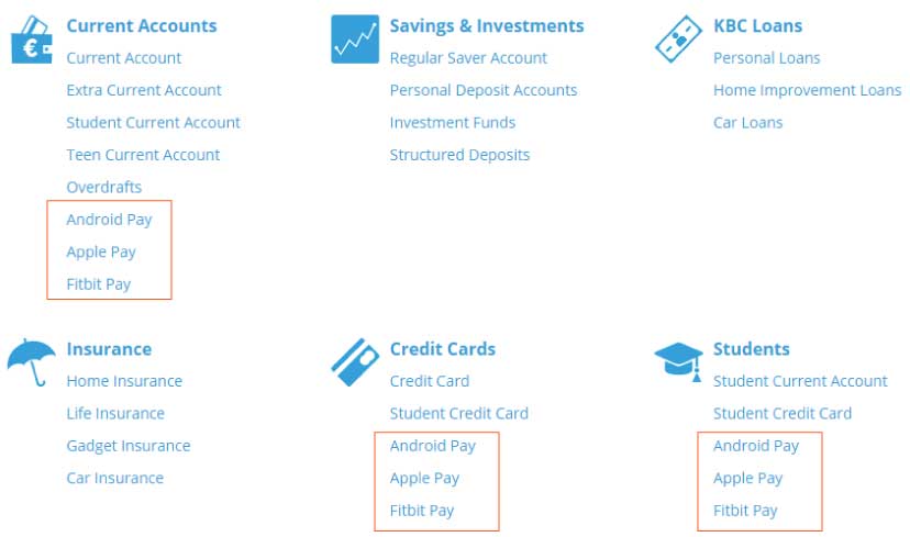
There is link repetition with links to information about Android Pay, Apple Pay, and Fitbit Pay each appearing three times in the same menu panel.
2.2 Site Organisation
The overall content organisation structure on the site homepage appears to be matrix, however the poor visual hierarchy and random nature of topics and links make content scanning difficult and unpredictable.
One organisation system was observed on the site homepage, it is an ambiguous user-orientated topical scheme, it is audience-specific, and contact-oriented.

2.3 Labelling systems
A label audit was performed, most labels were rated satisfactory, however some tier 2 labels scored poorly.
| Score | Guide | Result |
| 0-1 | Very Problematic: Label must be changed; it may decrease findability and task success. | 3 labels identified |
| 2 | Problematic: Label should be changed; it may cause confusion when users are scanning the commands and making a decision about what to click. | 2 labels identified |
| 3 | Borderline: Label could be changed, but it’s not a serious threat, and when in context, can be understood. | 2 labels identified |
| 4-5 | Good: Label does not require changing. | 54 labels identified |
Tier 1 of the global navigation consists of four labels – Our Products, Why KBC, Contact Us, and Help. These labels scored well against the metrics of Specific , Concise, Comprehensive, Familiar, and Front-loaded.
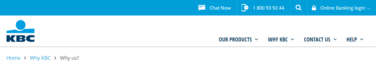
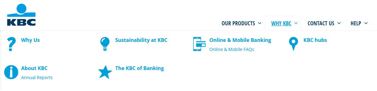
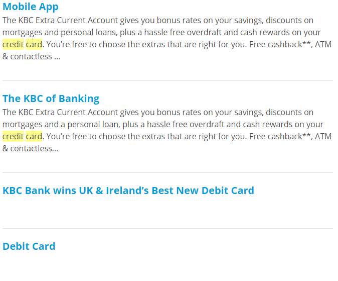
There is some inconsistent labelling – some labels refer to KBC in the third-person, some refer to KBC in the first-person, an example of this would be About KBC, and Why Us, both of which are found under the second tier heading of Why KBC (Fig. 6). For consistency, and where referring to KBC is not essential to brand guidelines, or product naming conventions. It is suggested to use the less formal, first person reference Us, in keeping with the general tone of voice of the website.
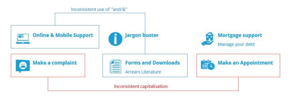
There are label syntax issues on all menus, there is inconsistent capitalisation and “and” and “&” are used inconsistently (Fig. 7).
3. Icons
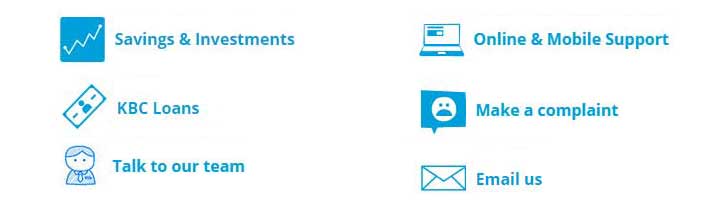
Icons are used as an aid to label recognition, in a lot of cases in HBC.ie’s navigation system the icons’ styles and visual weight are not consistent. Some appear to be in a hand-drawn style, while others are outlined, and others are solid (Fig. 8).
Where icons are used for individual links (Fig. 9), rather than menu category headings, alignment seems incorrect.
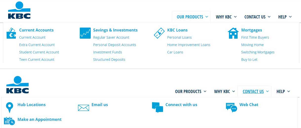
Above we can see inconsistent use of icons with labels – under the tier 1 Our Products only section headings have icons. Under the Contact Us heading, all labels have icons. The labels in the Contact Us menu all appear to be treated as section headings.
4. KBC Search system

The KBC search system is accessed by a sliding panel above the global navigation (Fig. 12). It is a very basic system. Users cannot search within specific content components, and there is no search filtering.
Users are unable to refine their search. There is no autosuggest or autocomplete functionality and no advanced search option.
The search results page is also basic, the search phrase is highlighted in the results, but users are unable to refine their results. Results appear to be a mixture of representational content – headings alone – and descriptive content – headings with truncated content snippets.
There is no pagination, and the number of results is not displayed. More results are loaded by clicking a Load More Results button. There are no options for sorting or ranking.
5. Card Sorting
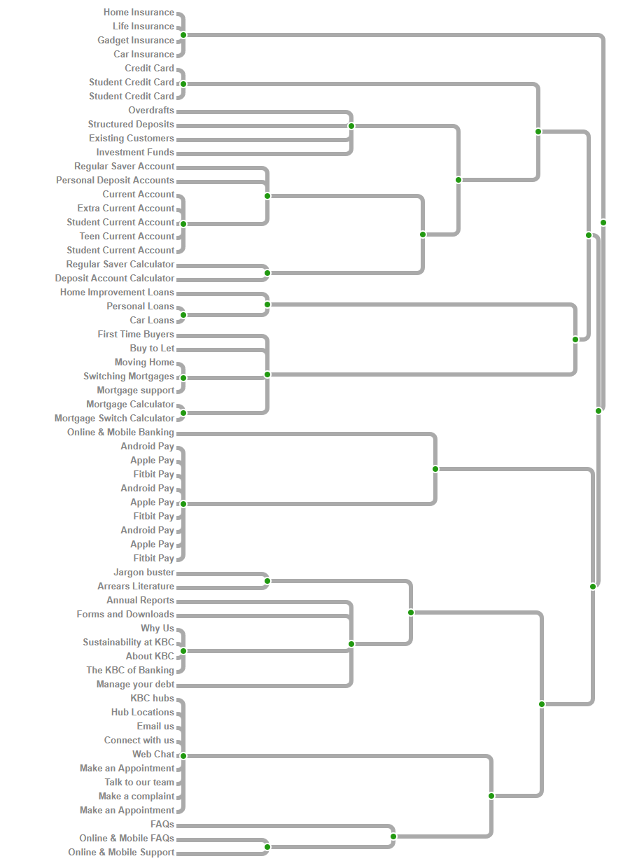
In order to redesign the main navigation system, an open card sort exercise is employed, using the current navigation system’s links. In total five respondents completed the card sort.
8. Proposed New Navigation System – Global Navigation
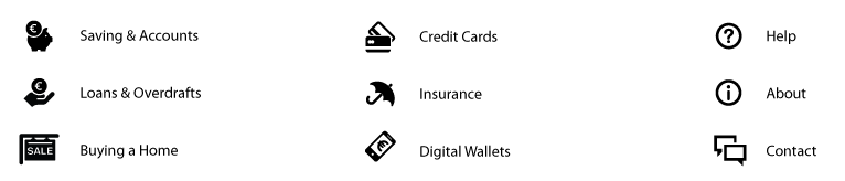
Following the card sorting exercise the proposed new menu would have a broad and shallow structure. The previous menu had an Our Products link, which had eight sub-headings, and 46 links in total, these links were re-categorised into six new groups, all of which would be moved to the top tier of the menu. The new categories were:
- Saving & Accounts
- Loans & Overdrafts
- Buying a Home
- Credit Cards
- Insurance
- Digital Wallets
The three remaining top level links, from the old menu structure were retained, but following the label audit they were renamed:
- Help
- About
- Contact
8.1 Proposed New Icon Set
The proposed new icon set have a unified visual weight, and visual style. Menu headings, of lesser commercial importance – Help, About and Contact have a slightly reduced visual weight.
8.2 Proposed New Menu Structure
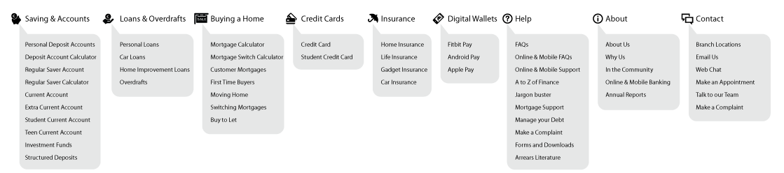
The proposed new menu structure removes the duplication of the digital wallet links highlighted in Fig. 4 and creates a separate Digital Wallet heading in the main top tier of the menu. Should space be a concern it would be proposed merging the digital wallet items with the Help menu, as they are purely informative, about the digital services themselves.
All label changes from the label audit have been implemented, they are:
- Existing Customers has been changed to Customer Mortgages
- The tier one label Why KBC has been changed to About
- Sustainability at KBC has been changed to In the Community
- KBC Hubs has been changed to Branch Locations
- The KBC of Banking has been changed to A to Z of Finance
- Hub Locations has been changed to Contact
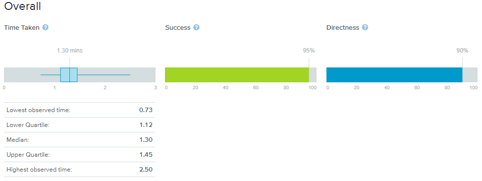
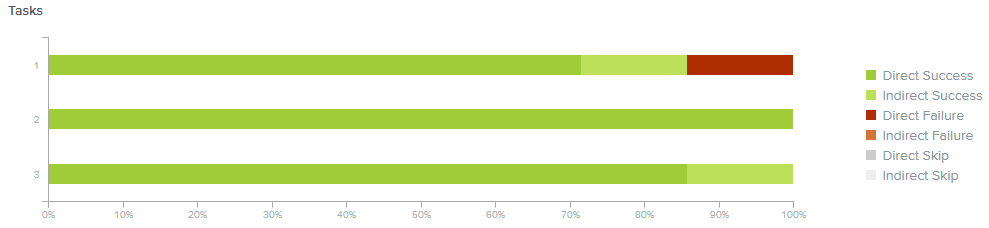
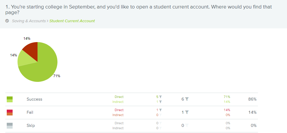
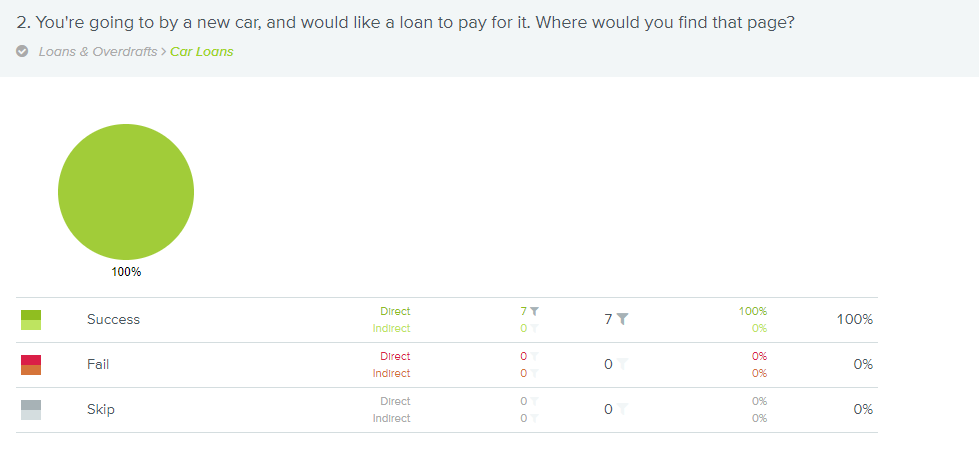
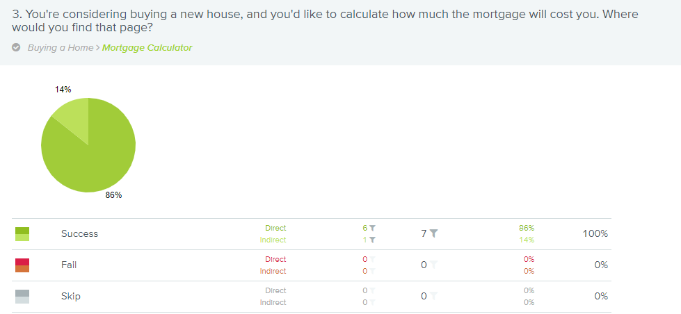
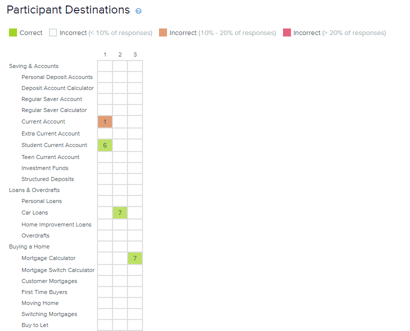
7. Tree testing
To validate the menu redesign, tree testing was performed. Three core tasks were identified, and a task was scripted for each task. A total of seven people carried out the tests, with none abandoning. There was an overall success rate, in completing the tasks, of 95%.
Bibliography
O’Brien D. (2009, December 5). Tree Testing: A quick way to evaluate your IA. Retrieved February 2, 2018 from http://boxesandarrows.com/tree-testing/
O’Brien D. (2016) The design phase: going wide Retrieved February 7, 2018 from https://treetesting.atlassian.net/wiki/display/TTFW/The+design+phase%3A+going+wide
Optima Workshop How to write effective tasks for your tree tests Retrieved February 1, 2018 from https://support.optimalworkshop.com/hc/en-us/articles/204442140-How-to-write-effective-tasks-for-your-tree-tests
Meyer K. (2016) How Chunking Helps Content Processing. Retrieved February 6, 2018 from https://www.nngroup.com/articles/chunking/
Usability.gov Card Sorting Retrieved February 4, 2018 from https://www.usability.gov/how-to-and-tools/methods/card-sorting.html
Nielsen J. and Li A. Mega Menus Work Well for Site Navigation. Retrieved February 4, 2018 from https://www.nngroup.com/articles/mega-menus-work-well/