I was on the lookout for an accessible, pure CSS, floated form label. Lots of different solutions were available, but none fully suited my needs.
Requirements were:
- No JavaScript
- It had to be accessible
- It had to use appropriate html attributes, or failing that, attributes that would not affect its use, or accessibility
- The label appears if the input receives focus – even when the input has data
After searching for quite a while I found “Javascript-full Float Label Pattern by Jordan Little” but it used Javascript to add/remove classes. I was able to remove the Javascript and edit the CSS to the point where it met most of my requirements, but I hit a wall when an input which had data, lost focus – the label would return to its position and cover the value. So I tried a different approach.
I gave each input a placeholder (In reality we don’t need a placeholder, as the floating label will be filling that role.
However the reason it was added is that, an input shows a placeholder when there is data, and it doesn’t when there is no data, using the :placeholder-shown pseudo-class the input can potentially have two different states. Using adjacent selectors I could then pass those states to the label, and style it accordingly.The finished form acts like this:
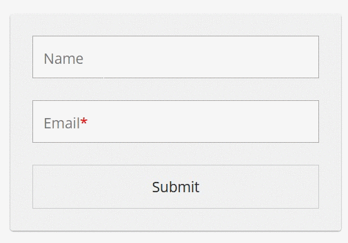
The HTML is very straightforward
 <div class="labfloat">

<input type="text" id="name" placeholder="name" />

<label for="name">Name</label>

</div>

<div class="labfloat">

<input type="email" placeholder="email" id="email" required />

<label for="email">Email</label>

</div>

<button>Submit</button>
The only noteworthy thing is, I’ve added a div.labfloat around each form field and label, this will be used to position elements within it:
.labfloat {

position:relative;

margin-bottom:2rem;

}
Then we hide the real placeholder text – it’s not needed, as we will be using the <label> in its place:
::placeholder {

opacity:0;

}
In order for the label to be correctly positioned over the input when it is in focus we reduce the bottom padding of the input:
input {

padding:1.4rem 1rem .6rem 1rem;

width:100%;

font-size:1.3rem;

border:1px solid #aaa;

font: 1.3rem "Open Sans", sans-serif;

color:#666;

transition: all .25s ease-in-out;

}
We set the default positioning of the label, this visually positions the label inside and over the input, giving it the appearance and positioning of placeholder text:
input + label {

display:block;

cursor:text;

color:#777;

transition: all .25s ease-in-out;

position:absolute;

top:1.2rem;

left:1rem;

font: 1.3rem "Open Sans", sans-serif;

}
When the input receives focus we reposition the label, closer to the top of the input and reduce its size:
input:focus + label {

top:.25rem;

font-size: 1rem ;

}
When the placeholder is not shown – eg. when the input has data, change the input padding to vertically center the data:
input:not(:placeholder-shown) {

padding:1rem;

}
Also, when the placeholder is not shown – we need to hide the label:
input:not(:placeholder-shown) + label {

opacity:0;

}
If a form field with data receives focus, we want to make the label visible again:
input:focus:not(:placeholder-shown) + label {

opacity:1;

}
If the user returns to edit the input data change the padding again, to accommodate the now-visible label and the data:
input:focus:not(:placeholder-shown) {

padding:1.4rem 1rem .6rem 1rem;

}
This is it below, I’ve no doubt it can be improved, and I’ve probably made a few errors, please let me know below if I have. I’ve only tested it on modern browsers, as it’s meant for mobile.
See the Pen Flat minion by Cormac Maher (Cormac Maher) on CodePen