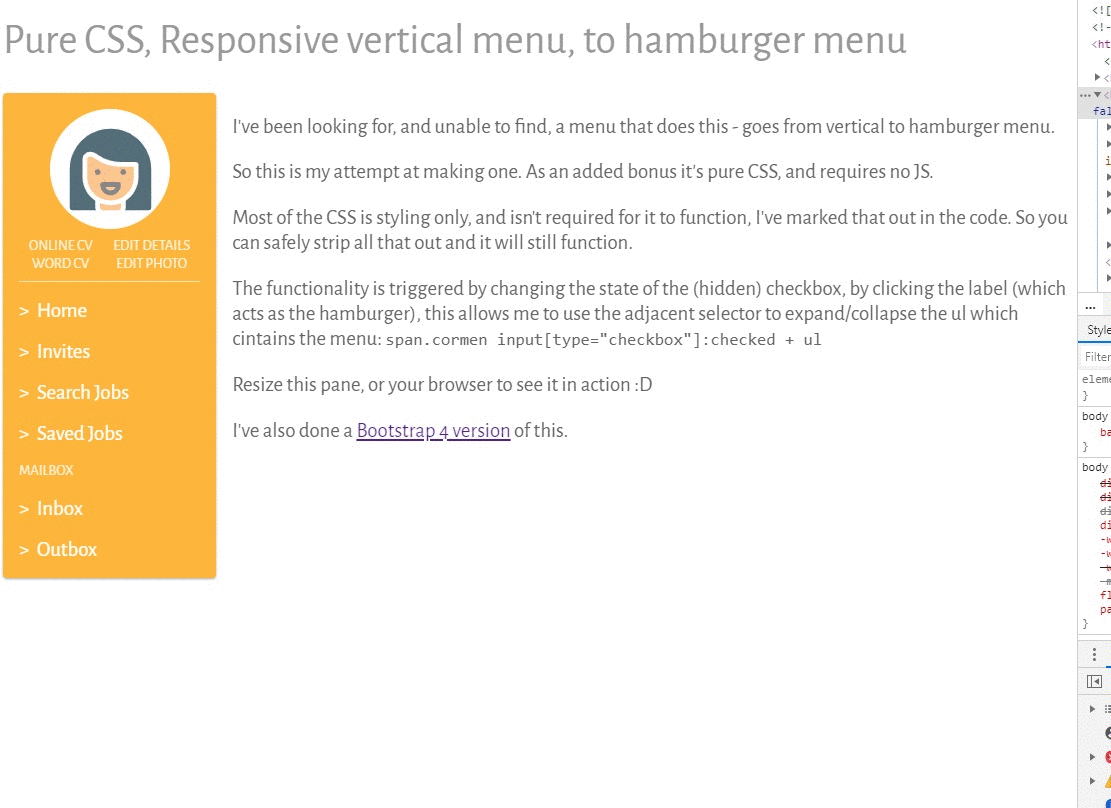
I’ve been looking for, and unable to find, a menu that goes from a vertical menu to hamburger menu.
So this is my attempt at making one. As an added bonus it’s pure CSS, and requires no JS.
I’m not going to explain how it works in detail, but basically the functionality is triggered by changing the state of the (hidden) checkbox, by clicking the label (which is styled as the hamburger), this allows me to use the adjacent sibling combinator to expand/collapse the ul which contains the menu: span.cormen input[type="checkbox"]:checked + ul this allows the checkbox to be (incorrectly) used as a button/trigger when it’s in its hamburger state, to expand/collapse the <ul> that contains the menu.
In an attempt to mitigate any accessibility issues I may trigger by using the checkbox in this way, I’ve used the aria-hidden=”true” attribute to hide it from compliant accessibility hardware/software.
I’ve done a version for Bootstrap 4 here and another version, that uses my own CSS here.
See the Pen
Pure CSS, Responsive vertical menu, to hamburger menu by Cormac Maher (@Cormac-Maher)
on CodePen.