This prototype was created using Adobe Photoshop, Adobe Illustrator, and ProtoPie. You can view the prototype here.
Category: Storee App
Section 1 – Problem identification/Ideation
1. Project Background
This project is part of year two of the PgDip in User Experience Design, in the Institute of Art, Design, and Technology in Dun Laoghaire. The project context is:
The project requires students, working individually, to design a high-fidelity interactive prototype to address a need of their choosing. Each student should also test their prototype design to evaluate it in terms of user experience and usability. The design process should be iterative and evidence of the evolution of the design should be provided.
Section 2 – Problem Statement
Problem Statement
We have observed that there is no current means of sharing a user’s experiences. This is preventing others from accessing and benefitting from that knowledge. We plan on improving that by producing an app that will allow users record related written, photographic, audio and video media, easily, and by making it easliy accessible by others.
Section 3 – Research
3. Research
Two forms of research were initially undertaken. The first was a round of competitor analysis, and the second was a survey. The competitor analysis initially focused on tourism-related apps and was extended to in include social media apps at a later stage.
Read On >>Section 3 – Research
Section 4 – Job Story, and Task Descriptions
Job Story
When I’m pursuing my interests, I want to share my experience, so that others can benefit. Read On >>Section 4 – Job Story, and Task Descriptions
Section 5 -Personas
The persona created, Jenny Miller, was based on the user survey – a tech savvy female, aged 33 and a frequent user of social media. Jenny travels regularly and is an avid amateur photographer. Jenny would be both a contributor to, and consumer of, app content. Read On >>Section 5 -Personas
Section 6 – Prototypes and User Testing
Wireframes
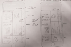
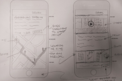
In the early stages of wireframing and prototype development hand-drawn wireframes were created to explore the basics of the functionality, and layout.
Fig 1 – Early app sketches
User Testing – Prototype V1
The prototypes used for user testing were mid-fidelity, the individual screens were created using Adobe Illustrator, and the interactive prototype was created using InVision.
The platform chosen for the app was Google’s Android operating system.
You can view the prototype here.
There was a total of three iterations, all based on user feedback during testing, and to address issues in the test script. Read On >>Section 6 – Prototypes and User Testing
Section 7 – High Fidelity Interactive Prototype
Design Iterations
There were a number of iterations of the UI design over the final stages of the project.
In the medium-fidelity prototype stage, on the app homescreen, the design showed more elements – category headings had icons, and each story tile had a Like and Download button. As the design moved into the high-fidelity stage, and real photographs were used instead of placeholders, it was clear these elements were adding clutter unnecessarily. As a result the Like and Download buttons were moved into an overflow menu, accessed on the top right-hand-side of each tile. Read On >>Section 7 – High Fidelity Interactive Prototype
References
Section 1
Ideation (creative process). (2017). En.wikipedia.org. Retrieved 11 December 2017, from https://en.wikipedia.org/wiki/Ideation_(creative_process)
Benjamin, A Design: How to define the problem. – Prototyping: From UX to Front End. (2017). Prototyping: From UX to Front End. Retrieved 12 December 2017, from https://blog.prototypr.io/design-how-to-define-the-problem-5361cccb2fcb#.vzy05lkr7 Read On >>References

