Design Iterations
There were a number of iterations of the UI design over the final stages of the project.
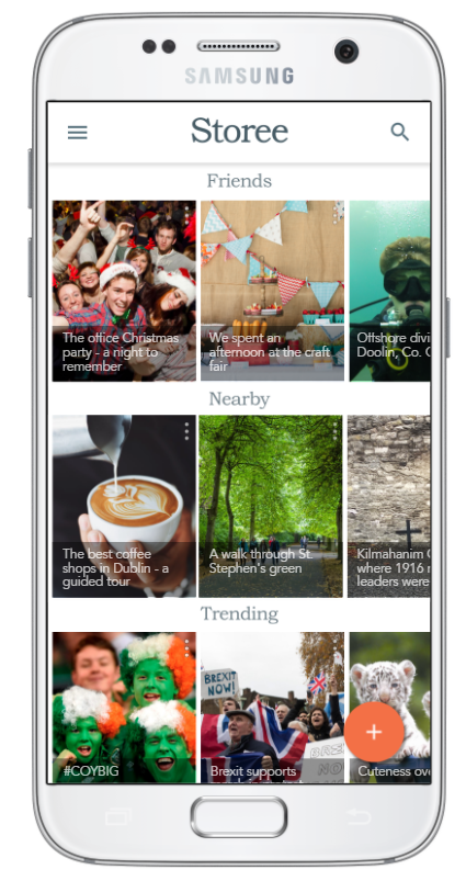
In the medium-fidelity prototype stage, on the app homescreen, the design showed more elements – category headings had icons, and each story tile had a Like and Download button. As the design moved into the high-fidelity stage, and real photographs were used instead of placeholders, it was clear these elements were adding clutter unnecessarily. As a result the Like and Download buttons were moved into an overflow menu, accessed on the top right-hand-side of each tile.
In scenario two, where the user adds a story, the early-stage prototypes showed a toolbar that was not fixed, and moved down the screen as the story was built. In the high-fidelity stage, and in keeping with Material Design guidelines, this toolbar was fixed to the bottom of the screen for the final prototype.
The medium-fidelity wireframes hinted at a less formal design than the finished prototype. These wireframes showed a logo with a casual, sans-serif, brush script, and this initial design was intended to be colourful and to use a swatch based on Google’s Material Design palette. However, again, as I moved to a higher fidelity, it was clear these colours were detracting from, and clashing with the imagery, and were having an adverse on the visual hierarchy of the UI.


Fig. 1 – Design iterations
The final design is inspired by newsprint, the logo and category headings use a serif font, Bookman Old Style, and in the logo letters were intentionally misaligned, colour was removed wherever possible allowing for the users’ images to feature as the main design elements.
The artwork for each screen was created using Adobe Illustrator and Adobe Photoshop, and the design language being followed was Google’s Material Design.
As some of the prototype screens would require more complex animations, and more advanced editing features, beyond the current capabilities of InVision, I chose to use ProtoPie to create the final interactive prototype.
The finished screens were imported into ProtoPie where the animations, multimedia, and interactions were added.
The two tasks that were assessed throughout user testing were to be recreated for this prototype.
To recreate the first task, on the app homescreen tap the “The best coffee shops in Dublin – a guided tour” to view a typical Storee story, two chapters of the story have been prototyped.
The second task, to create a new story can be viewed by clicking the orange, floating action button, on the bottom right hand side of the app screen.
You can also view an app demo below.
Fig. 3 – Pre-recorded app demo