Wireframes
In the early stages of wireframing and prototype development hand-drawn wireframes were created to explore the basics of the functionality, and layout.


Fig 1 – Early app sketches
User Testing – Prototype V1
The prototypes used for user testing were mid-fidelity, the individual screens were created using Adobe Illustrator, and the interactive prototype was created using InVision.
The platform chosen for the app was Google’s Android operating system.
You can view the prototype here.
There was a total of three iterations, all based on user feedback during testing, and to address issues in the test script.
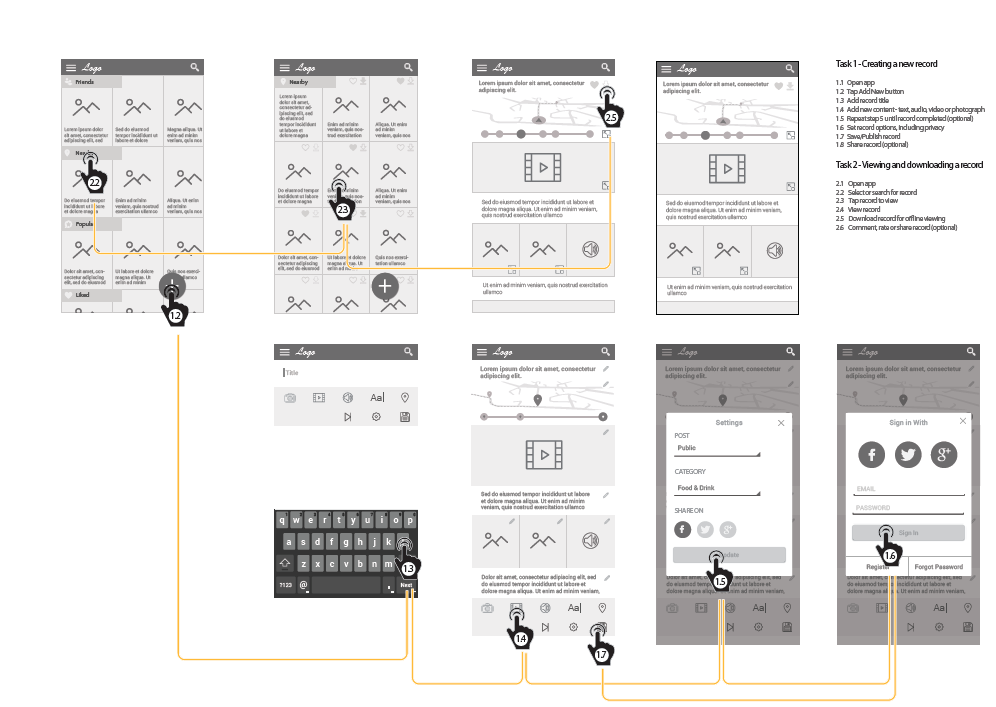
Prototype V1 Screens


Fig 2 – V1 app prototype screens
Test Details
The first round of testing was carried out on five users, using a low fidelity interactive prototype, created using InVision
Tasks/Scenarios
Two tasks/scenarios were proposed in test script to subjects – they were
1 – You are on holidays in Dublin. Before you embarked on your trip you found, liked, and downloaded for offline-viewing, a tour called Great Coffee Shops in Dublin, the tour starts close to your hotel, and you would now like to find it and take it. Your task is to find the tour and view it.
and, the second scenario:
2 – You are on a night out in Dublin, and you want to record the night – including photos, video, audio, and you want to share a link to it on Twitter, you also want to make the event public, so other users of the app can view it.
Test Recordings
- User 1 – test recording, and video
- User 2 – test recording, and video
- User 3 – test recording, and video
- User 4 – test recording, and video
- User 5 – test recording, and video
Test Results/Feedback
All tasks were completed. Some users had issues with the location of the Share button, the cog icon used to open the modal was highlighted as being a contributing factor. A lot of the test subjects found the tests difficult as text content was generated using filler text (Lorem Ipsum). Also, the choice of using the word “Experiences” and “Steps / Stages” to describe individual entries, was not a helpful mental model.
User 1
- Could not find the share functionality, and incorrectly clicked the “Add Stage” button
User 2
- Had trouble finding the Coffee Shop tour, on the Nearby page, as there were no descriptions on the individual entries as filler text had been used, he eventually found it via the Downloaded and Like buttons
User 3
- Would not have noticed the “Downloaded” icon, would have looked for a star to indicate the tour had been downloaded, instead of the icon used
- Used process of elimination to find the Share icon – eliminating all other icons before choosing the correct one
User 4
- Clicked the Add button when searching for the Coffee Shop tour
- Could not find Share icon, as it was in the Settings modal
- Did not notice Downloaded and Liked buttons
User 5
- Used process of elimination to find the Share icon – eliminating all other icons before choosing the correct one
- Was confused by the proximity of the Edit options to the File options – suggested they should be separated
User Testing – Prototype V2
As a result of feedback from the tests on version 1 the following changes were made:
- The use of the word “Experience” and “Stages” to describe the concept behind the app did not appear to help the user form a useful mental model. This was replaced by “Story” and “Chapter” – the name of the app was changed to “Storee”, in that a contributor writes a story, and each story would be composed of chapters (whereas before a chapter was called a stage)
- English content was used in the second prototype, as the use of lorem ipsum filler text had confused test subjects
- Liked and Downloaded categories were added to the homescreen
- On the category listing page the category description was changed to uppercase, and spanned the width of the screen, to increase legibility
- The Liked and Downloaded icons, which indicate whether the user has liked or downloaded a story were put on a white background to increase discoverability
- A Share icon was added to the top of each story, beside the Like and Download icons
- On the Add New Story page, the label “Storee Title” was added to reinforce the mental model
- The Edit and File options were visually separated, using a darker coloured background for the File options
- The File options buttons were changed, from icons to text
- The Settings icon was removed
- The options (story privacy and story tags) from the removed Settings icon were moved to the first stage of the Save & Publish process, and the login form was moved to the second (and final) stage of the process
- Optional Share icons were added to the confirmation page, displayed after the contributor had published their story
Test Recordings
User 1
- Successfully completed the first task
- Completed most of the second task, but could not complete the newly-added “Save & Publish” process due to ambiguous modal title and button labelling
Test Details
The second round of testing was carried out on one user. The user being tested was an eight-year old boy, parental consent was given, and he successfully completed the first task, but failed to complete the second task at the final stage of the task – the newly added Save & Publish Process – the labelling and titles on this modal did not match the button label “Save & Publish”, and there was no progress indicator, to signal to the user it was a two-step process.
You can view the prototype here.
I decided to iterate again, creating a third prototype to include these small changes before continuing my tests.
Prototype V2 Screens


Fig 4 – V2 app prototype screens
User Testing – Prototype V3
As a result of feedback from the tests on version 2 the following changes were made:
- The modal title on the Publish process was changed to “Publish Your Storee”
- A progress indicator was added to show the user it was a two-stage process
- A secondary heading, on the Publish modal, was added to explain to the user what each stage related to
Test Recordings
- User 1 – test recording, and video
- User 2 – test recording, and video
- User 3 – test recording, and video
User 1
- Successfully completed both tasks
- Had some concerns about the lack of an icon next to the “Publish”, “Save Draft”, and “Add Chapter” buttons
User 2
- Successfully completed both tasks
- Found the functionality easy to use, despite being an iOS user, and the wireframes being in Google’s Material Design language
User 3
- Successfully completed both tasks
Test Details
All users completed both tasks, the only concerns voiced were from User 1, who had expected to see icons next to the “Publish”, “Save Draft”, and “Add Chapter” buttons. However, such a design is not in keeping with Google’s Material Design guidelines.
You can view the prototype here.
Prototype v3 Changed Screens


Fig 5 – V3 app prototype screens
